
The Thumbnail Test
Before you fall in love with a cover, shrink it. Put the image on your screen at about one inch wide, or view it on your phone from arm's length. Squint if it helps.
Ask three questions. Can you read the title? Can you tell what kind of book it is? Is there a single thing your eye goes to first? If the answer to any of these is no, the cover needs simplifying, however beautiful it looks at full size.
Run the test on every concept, and run it in grayscale as well. A cover that depends on subtle color differences to separate text from background will fall apart in a small grid next to dozens of others. Then compare your cover side by side with the top results in your category. Yours should be recognizable as the same kind of book, but not mistaken for any one of them.
Signal Your Genre Before Anyone Reads a Word
Readers shop by genre. A romance reader scanning a page of thumbnails is not reading titles, she is recognizing a visual language: color, type style, illustration or photography, and the position of the author name. The same goes for thrillers, cozy mysteries, business books and memoirs.
That does not mean copying another cover. It means knowing the conventions well enough to follow the ones that matter and break the ones that do not. Look at ten recent covers in your category and note what they share. Is the type huge or small? Are the colors dark or bright? Is there a person on the cover or an object?
Then choose one idea for your own cover and commit to it. Covers that try to show the whole plot usually show nothing. A single image or symbol, drawn from the heart of the book, does more work than five.
If your book is nonfiction, the cover should promise a result or an angle, and the subtitle should carry the practical details. A memoir cover often leans on a strong image and a quiet, confident title.
Typography That Survives Shrinking
Type is where most do-it-yourself covers fail. At thumbnail size, a delicate script or a long subtitle becomes a smear.
A few guidelines hold up well:
- Make the title the largest, most readable element. Hierarchy matters more than order, so the author name can sit above or below as long as it is clear.
- Choose strong contrast between text and background. The contrast guidelines published for web accessibility give useful numbers if you want to check your color pairs, and they help readers with low vision too.
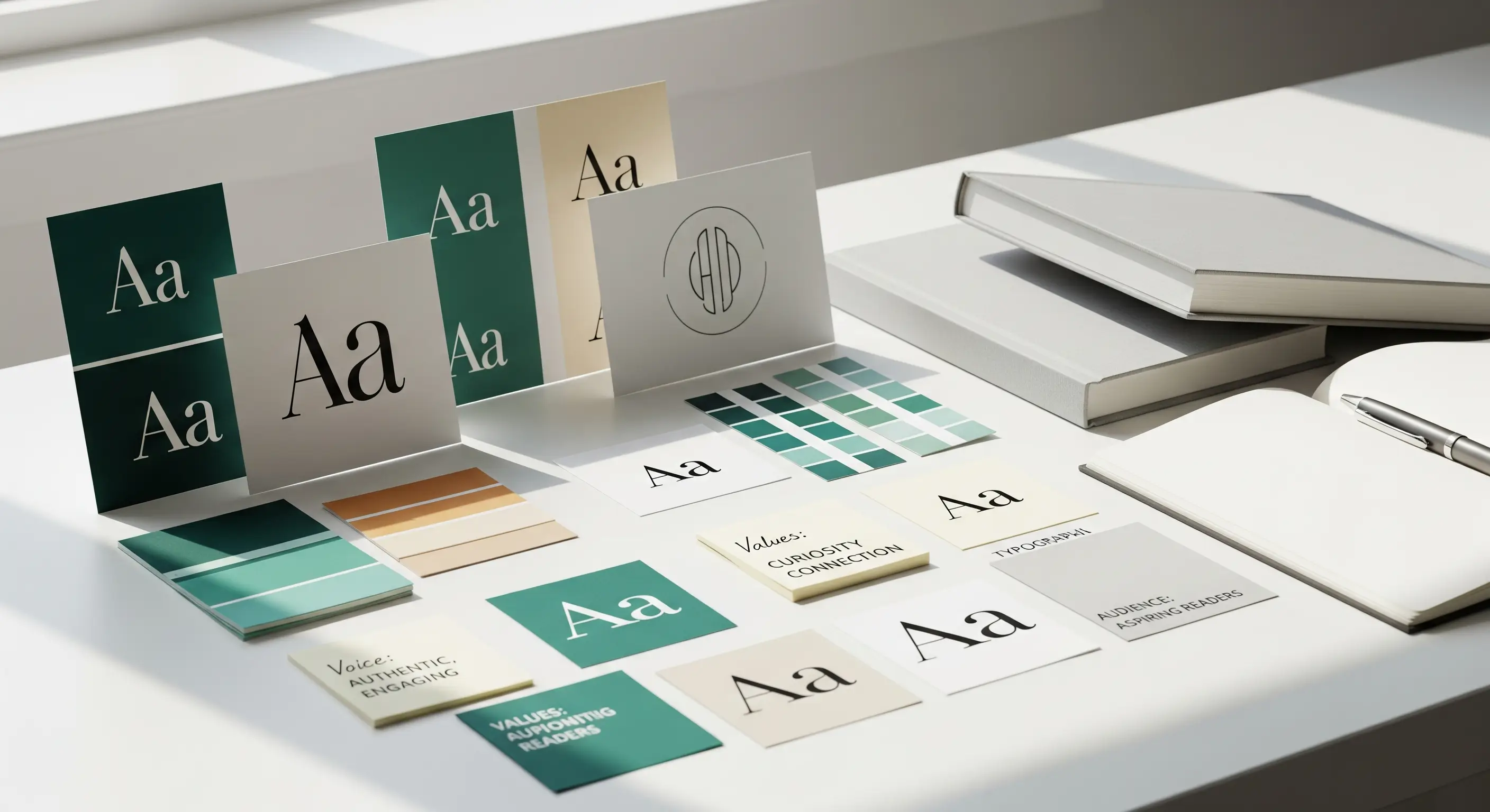
- Use one or two typefaces at most. Pair a bold title font with a quiet supporting one.
- Keep the subtitle short, or leave it off the cover and put it in the listing. If the title says it all, you do not need a subtitle.
- Avoid long words in thin, decorative fonts, and be careful with letters that blur together when small.
- Keep text away from the edges and the spine fold, so nothing is lost in trimming or curves out of sight.
Test the author name too. If you write a series, your name often matters more than the title, and it should be readable in the same glance.
Image and Color Choices
Use a limited palette. Two or three main colors, with one accent, create a mood and keep the eye moving to the title. A busy image with ten colors turns to mud when shrunk.
Aim for one focal point. That could be a face, a silhouette, an object, or a bold shape. Leave breathing room around it, because empty space is what makes the title legible.
Be cautious with stock photos. Many stock images are used on dozens of covers, and readers do notice. If you do use stock, choose something distinctive and ask your designer to modify it so it feels specific to your book. Personal snapshots rarely work unless you are a professional photographer. For children's books and illustrated covers, original art is worth a look, and our illustration services cover custom cover art.
Photography, painted art and bold flat graphics each suit different genres, so choose the approach that fits your readers instead of your personal favorite. Finally, think about mood. Warm tones feel friendly and nostalgic. Cold blues and grays feel tense or serious. Bright pastels suggest light reads. None of these is a rule, but they are cues readers already know.
Details That Matter for Print and Ebook
A cover is more than a front image. A printed book has a back cover, a spine and a margin around the edges that gets trimmed during production. Each of these needs to be correct before the file goes to the printer.
For print, the designer needs your final page count, because spine width depends on it. Print files typically need extra bleed around the edges, high resolution images and the right color mode for the printer. Retailers publish their own specifications, and the paperback cover requirements are a good example of what a printer expects. Do not guess these numbers, and do not rely on a cover made for a different trim size.
For ebooks, you need a separate, high resolution image in the proportions the retailer requires. Check the ebook cover image criteria before you finalize. Remember that the ebook cover is the only part of the book some readers will ever see, so it needs to work without a spine or back copy to support it.
Leave clear space on the back cover for the barcode and ISBN, and keep important text away from the trim edge. Our article on what to check before you publish includes a proof review that catches most cover errors.
How to Brief a Designer for Your Book Cover Design
A designer works best with a short brief, not a finished idea. Share your genre, a one-paragraph summary, your reader, the mood you want and three covers you like with a note on why. Add what you dislike, because "no purple" or "no people" saves a round. Mention any scenes, symbols or characters that must appear, and any that should never appear.
Ask for two or three distinct concepts rather than one polished one, and agree how many revision rounds are included. Look at each concept at thumbnail size before you comment. Give feedback in terms of the reader: "this does not look like a thriller" is more useful than "I don't like it." Our book cover design services follow this approach and are quoted per project after a free consultation.
If you are building a series, mention it up front so the first cover can be extended to the rest. A consistent look across books is part of your author brand.
FAQs
Can I use my own artwork or photo on the cover?
Yes, if the image is high resolution and you own it or have a license. A designer can often shape your image into a professional cover with the right type and layout.
Does my ebook cover need to be different from my print cover?
Not in design, but in format. The ebook uses the front image alone, while print needs the full wrap with spine and back cover.
How do I know if my cover is working?
Show it to readers of your genre at thumbnail size and ask what kind of book it is. If most of them guess correctly and can read the title, you are on track.
A strong book cover design is the first promise you make to a reader. Get a free consultation and we will talk through concepts that suit your book.